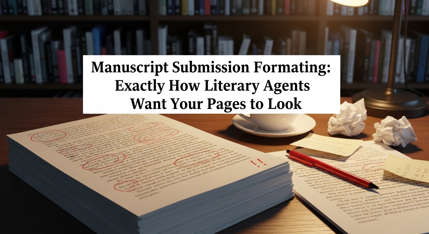
Formatting a manuscript might seem like a small, technical step in the publishing journey, but in reality, it plays a far bigger role than most writers expect. Before a literary agent reads your story, they see how it’s presented, and that first visual impression can quietly influence everything that follows. A well-formatted manuscript signals professionalism, attention to detail, and an understanding of industry standards, while a poorly formatted one can create unnecessary distractions, no matter how strong the writing may be.
This blog takes a closer look at exactly how literary agents expect your manuscript to appear when it lands in their inbox. From the structure of your pages to the finer details that often go unnoticed, understanding these expectations can help you present your work with clarity and confidence. Because in a competitive publishing landscape, it’s not just about telling a great story, it’s about making sure nothing stands in the way of it being read the way it deserves.
The Quiet Gatekeeper of Publishing Success
There is a persistent myth among aspiring authors that formatting is a minor technicality, something secondary to the brilliance of the story itself. While it is true that compelling writing ultimately determines whether a manuscript succeeds, formatting often acts as the first silent filter between a writer and a literary agent. Before a single sentence is fully absorbed, the visual presentation of a manuscript has already begun shaping perception.
Agents are not simply reading; they are evaluating under pressure. Their days are filled with submissions, each competing for limited attention. In this environment, familiarity becomes essential. A manuscript that looks exactly as expected allows the agent to slip seamlessly into the reading experience. One that does not introduces friction, and in a competitive landscape, even subtle friction can be costly.
Formatting, then, is not about rigid tradition. It is about eliminating barriers. It ensures that nothing, neither visual clutter nor inconsistency, distracts from the narrative voice the writer has worked so hard to develop.
How Industry Standards Became the Norm
The conventions of manuscript formatting did not emerge arbitrarily. They evolved over decades of publishing practice, shaped by the needs of editors, agents, and printers. Even as the industry has shifted from typewritten pages to digital submissions, these standards have endured because they continue to serve a practical purpose.
Double spacing, for instance, originated in the era of physical manuscripts, allowing editors to mark corrections between lines. Today, it still reduces visual density, making text easier to read on screens for extended periods. Similarly, the preference for fonts like Times New Roman is rooted in readability and neutrality. It presents the text without stylistic interference, ensuring that the writing itself remains the focal point.
Margins, headers, and indentation rules all contribute to this same goal. They create a structured, predictable layout that agents can navigate instinctively. When a manuscript adheres to these norms, it becomes invisible in the best possible way. The reader is not aware of the formatting because it works exactly as expected.
The Reading Experience from an Agent’s Perspective
To understand formatting fully, it helps to step into the mindset of a literary agent. Imagine opening dozens of documents in a single day, each representing hours or years of someone’s creative effort. The agent must quickly determine which projects merit further consideration, often making decisions within the first few pages.
In this context, clarity is everything. A well-formatted manuscript allows the eye to move effortlessly across the page. Paragraphs are clearly defined, dialogue is easy to follow, and the overall structure feels intuitive. The agent can focus entirely on tone, pacing, and voice.
When formatting is inconsistent or unconventional, the experience changes. The agent may pause to adjust to unusual spacing or struggle with dense blocks of text. These interruptions, however small, accumulate. They disrupt immersion, making it harder for the writing to make its intended impact.
Formatting, therefore, is not separate from storytelling. It directly influences how the story is received.
Building the Foundation: The Standard Manuscript Layout
At the heart of manuscript formatting lies a set of widely accepted standards that function as the industry’s baseline. These standards are not restrictive but rather supportive, providing a framework within which the writing can shine.
A manuscript should be presented in a clear, readable font, most commonly Times New Roman at 12-point size. The text should be double-spaced throughout, including dialogue and narrative passages. Margins should be set to one inch on all sides, creating a balanced and uncluttered page.
Paragraphs should begin with a consistent first-line indent, typically half an inch, rather than being separated by extra spacing. The text should remain left-aligned, avoiding full justification, which can create uneven gaps between words and disrupt readability.
Each page should include a header containing the author’s last name, a shortened version of the manuscript title, and the page number. This detail, though often overlooked, ensures that pages remain identifiable if they are separated or printed.
These elements work together to create a uniform appearance. They establish a visual rhythm that supports sustained reading, allowing the agent to engage with the content without distraction.
The Importance of the Title Page and Opening Presentation
The title page serves as the manuscript’s introduction, offering essential information in a concise and professional format. It typically includes the manuscript’s title, the author’s name, contact details, and an approximate word count. While its design should remain simple, its presence signals completeness and attention to detail.
Following the title page, the manuscript begins on a new page. The opening paragraphs carry significant weight, and their presentation must reinforce their importance. Chapter headings, if used, should be clearly distinguished but not stylized in a way that draws unnecessary attention.
The goal is to create a seamless transition from presentation to storytelling. The reader should move naturally from the title page into the narrative, without encountering visual inconsistencies that disrupt the flow.
Digital Submission Realities and File Preparation
In today’s publishing environment, formatting extends beyond the page into the digital space. Literary agents often specify preferred file types, most commonly Word documents. These files allow for easy annotation and compatibility across devices, making them the preferred choice for many professionals.
PDFs, while preserving formatting precisely, can limit the ability to comment or edit. As a result, they are typically requested only in specific circumstances. Writers must pay close attention to submission guidelines to determine the appropriate format.
File naming conventions also play a critical role. A clear and professional file name, incorporating the author’s name and manuscript title, helps agents manage their submissions efficiently. It reflects an understanding of the practical aspects of the industry.
Even the act of attaching or pasting text into an email requires care. Some agents request sample pages within the body of an email, which introduces additional formatting considerations. In such cases, maintaining readability while adapting to email constraints becomes essential.
The Subtle Details That Define Professionalism
Beyond the foundational elements, it is often the smaller details that distinguish a polished manuscript from an unrefined one. Consistency is paramount. Line spacing should remain uniform throughout the document, and paragraph indentation should not vary from section to section.
Punctuation spacing, such as the use of a single space after periods, should be consistent. Dialogue formatting should follow standard conventions, ensuring clarity and readability. Even the treatment of scene breaks, often indicated by a simple symbol or blank line, should be handled with restraint and consistency.
These details may seem minor, but they contribute to an overall impression of care and precision. They signal that the writer has taken the time to refine not just the content but its presentation.
Common Formatting Pitfalls and Their Impact
Many manuscripts falter not because of major errors but because of an accumulation of small inconsistencies. A common issue is the use of multiple fonts or font sizes within the same document. This creates a disjointed appearance that distracts from the narrative.
Another frequent problem is inconsistent spacing, where some sections are double-spaced while others are not. This disrupts the visual rhythm of the text, making it harder to read. Similarly, improper margins or missing headers can create an impression of incompleteness.
Over-formatting is another pitfall. Writers sometimes attempt to enhance their manuscripts with decorative elements, unusual alignments, or stylized chapter headings. While these choices may seem creative, they often work against the goal of clarity.
Agents are not looking for visual innovation in a manuscript. They are looking for writing that stands on its own. Formatting should support that objective, not compete with it.
Formatting as an Extension of Editing
Formatting and editing are deeply interconnected. A well-edited manuscript naturally lends itself to clean, consistent formatting. Conversely, a manuscript that has not been thoroughly edited often reveals inconsistencies that extend into its presentation.
The process of preparing a manuscript for submission should include a dedicated formatting review. This involves not only checking for adherence to industry standards but also ensuring that the document is free from visual inconsistencies.
Reading the manuscript in its final formatted form can be particularly revealing. It allows the writer to experience the text as an agent would, identifying areas where presentation may detract from the reading experience.
Formatting, in this sense, becomes the final layer of refinement. It completes the transition from draft to professional submission.
A Comprehensive Reference Table for Manuscript Formatting
The following table provides a detailed overview of standard manuscript formatting requirements, offering a practical reference for writers preparing their submissions.
| Element | Standard Requirement | Why It Matters |
| Font | Times New Roman, 12-point | Ensures clarity and universal readability |
| Line Spacing | Double-spaced | Reduces visual strain and improves legibility |
| Margins | 1 inch on all sides | Creates a balanced and uncluttered layout |
| Alignment | Left-aligned | Prevents uneven spacing between words |
| Paragraph Indentation | 0.5 inch first-line indent | Defines paragraph structure clearly |
| Page Header | Last name, title, page number | Keeps pages organized and identifiable |
| Title Page | Title, author, contact info, word count | Presents key details professionally |
| Scene Breaks | Simple symbol or blank line | Maintains narrative clarity without distraction |
| File Format | .doc or .docx (unless otherwise specified) | Allows for easy editing and compatibility |
| File Naming | AuthorName_Title | Supports efficient file management |
| Spacing After Periods | Single space | Aligns with modern publishing standards |
| Chapter Headings | Simple, consistent formatting | Avoids unnecessary visual distraction |
This table reflects industry expectations rather than inflexible rules. However, adhering to these standards ensures that a manuscript meets the baseline criteria for professional submission.
Navigating Agent-Specific Requirements
While standard formatting provides a reliable foundation, individual agents often have specific preferences that must be followed precisely. These guidelines may include variations in file format, submission method, or even minor formatting details.
The key is to approach these requirements with precision. Each agent’s guidelines represent their workflow and preferences, and adhering to them demonstrates professionalism and respect. Ignoring or overlooking these details can undermine an otherwise strong submission.
Adapting to these requirements does not mean abandoning standard formatting. Instead, it involves making targeted adjustments while maintaining overall consistency. This balance allows writers to meet individual expectations without compromising the integrity of their presentation.
The Role of Formatting in First Impressions
First impressions in publishing are formed quickly and often subconsciously. A manuscript that appears clean, consistent, and professionally formatted immediately establishes credibility. It signals that the writer understands the industry and has taken the time to prepare their work thoroughly.
Conversely, formatting issues create doubt. They suggest a lack of attention to detail, which may extend beyond presentation into the writing itself. Even if the narrative is strong, these doubts can influence the agent’s perception.
Formatting, therefore, acts as a silent introduction. It sets the stage for the reading experience, shaping expectations before the first sentence is fully absorbed.
Preparing for Submission with Precision and Confidence
The final stage of manuscript preparation should be approached with care and intention. Formatting is not a task to be rushed but a process that requires attention to detail and a commitment to consistency.
Writers should review their manuscripts thoroughly, checking for adherence to both industry standards and agent-specific guidelines. Reading the document in its final form can reveal issues that may not be apparent during earlier stages of editing.
Confidence in submission comes from knowing that every aspect of the manuscript, from its content to its presentation, has been prepared to the highest standard. Formatting plays a crucial role in achieving that confidence.
Simplicity as a Professional Standard
In a field defined by creativity, the simplicity of manuscript formatting may seem paradoxical. Yet, it is precisely this simplicity that allows creativity to flourish. By removing visual distractions, standard formatting ensures that the writing remains the focal point.
Agents are not looking for visually striking documents. They are looking for compelling stories presented in a clear and accessible way. Formatting supports this goal by creating an environment in which the narrative can be evaluated on its own merits.
This commitment to simplicity is not a limitation but a strength. It reflects an understanding of the publishing process and a respect for the reader’s experience.
Final Reflection
Manuscript submission formatting is often underestimated, yet it plays a vital role in the journey from writer to published author. It is both a practical tool and a subtle form of communication, conveying professionalism, attention to detail, and an understanding of industry expectations.
By adhering to established standards and carefully reviewing every element of presentation, writers position their work for the best possible reception. Formatting does not guarantee success, but it ensures that nothing stands in the way of a manuscript being judged on what truly matters: the quality of the writing itself.
