
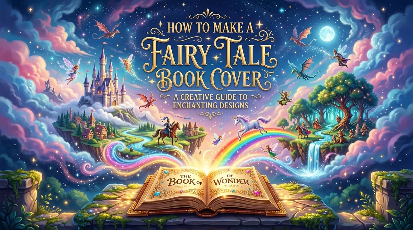
A fairy tale book cover serves as the magical gateway between a story and its readers. Before anyone reads the first sentence, the cover introduces the mood, setting, and promise of the tale hidden within the pages. Whether the book is intended for children, young adults, or even adults who enjoy fantasy literature, a well-designed fairy tale cover creates curiosity and emotional connection. It invites readers into enchanted forests, mystical kingdoms, hidden castles, and worlds where imagination reigns supreme.
The importance of book cover design has grown significantly in the modern publishing industry. With online bookstores and digital libraries becoming dominant, readers often make purchasing decisions within seconds based on visual appeal. A fairy tale cover must therefore balance artistic beauty with strategic design principles. It should communicate genre, attract the target audience, and capture the essence of the story while standing out among countless competing titles.
Creating a fairy tale book cover is not simply about adding castles, dragons, or magical creatures. It involves understanding storytelling, visual psychology, typography, color theory, and audience expectations. Every element contributes to the emotional experience of potential readers. This guide explores the process of creating a fairy tale book cover from concept development to final execution, helping authors, designers, and publishers produce covers that enchant and inspire.
How a Fairy Tale Book Cover Shapes the Story Experience
A fairy tale cover has a unique role compared to covers from other genres. Readers expect a sense of wonder, mystery, and magic. The cover should immediately signal that the story belongs to a fantastical world where extraordinary events can occur.
The cover also acts as a visual summary of the narrative. While it should not reveal every plot detail, it should hint at the central themes and atmosphere. A fairy tale involving an enchanted forest requires a different visual approach than one centered on a royal palace or underwater kingdom. The imagery should evoke curiosity while remaining faithful to the story’s essence.
Another important function is audience targeting. Fairy tales written for young children often feature bright colors, friendly characters, and playful illustrations. Fairy tales for older readers may incorporate darker tones, intricate artwork, and sophisticated typography. Understanding who will read the book helps determine every design decision.
The Elements That Define Fairy Tale Cover Design
Fairy tale covers typically share certain visual characteristics that distinguish them from other genres. These features have evolved through decades of storytelling traditions and reader expectations.
Magic is perhaps the most recognizable element. Designers often use glowing lights, sparkling effects, enchanted objects, or mystical landscapes to communicate supernatural wonder. Nature also plays a significant role. Forests, flowers, moonlit skies, waterfalls, and ancient trees frequently appear because they reinforce the connection between fairy tales and the natural world.
Royal imagery is another common feature. Crowns, castles, gowns, princes, princesses, and grand palaces symbolize classic fairy tale traditions. Even contemporary fairy tales often incorporate these motifs because they instantly connect readers with familiar storytelling archetypes.
The visual language should feel timeless. Unlike modern thrillers or contemporary fiction, fairy tale covers benefit from a sense of permanence that suggests stories passed down through generations.
Researching Successful Fairy Tale Covers
Before beginning the design process, studying existing fairy tale covers can provide valuable insights. Successful covers reveal patterns in composition, typography, color choices, and imagery.
Examining both classic and modern fairy tale books helps identify evolving trends. Traditional covers often emphasize hand-painted illustrations and decorative typography. Contemporary designs may blend digital art with minimalist techniques while still preserving magical themes.
Research should focus on understanding why certain covers attract attention. Some succeed because of their strong central imagery, while others rely on dramatic lighting or distinctive typography. By analyzing successful examples, designers can develop a clearer vision for their own projects.
It is equally important to identify overused clichés. While fairy tale covers often include castles and magical creatures, relying too heavily on generic imagery can make a cover feel predictable. Research helps strike a balance between meeting reader expectations and creating something fresh.
Building a Strong Cover Concept
Every memorable fairy tale cover begins with a compelling concept. Rather than jumping directly into artwork, designers should first identify the story’s core message and emotional tone.
A fairy tale about courage may focus on a young hero standing before a mysterious castle. A story about transformation might feature symbolic imagery such as butterflies, magical mirrors, or blooming flowers. The concept should represent the heart of the narrative rather than simply depicting random scenes.
Developing a clear concept ensures consistency throughout the design process. Every visual decision, from color selection to typography, should support the central idea. This creates a cohesive cover that communicates a powerful story even before readers open the book.
Choosing the Right Color Palette
Color plays a crucial role in shaping emotional responses. Fairy tale covers often rely on carefully selected palettes to establish mood and atmosphere.
Soft pastels create feelings of innocence, wonder, and enchantment. These colors are particularly effective for children’s fairy tales. Shades of pink, lavender, sky blue, and mint green can evoke dreamlike settings and gentle adventures.
Darker palettes communicate mystery and depth. Deep blues, rich purples, emerald greens, and silver accents are commonly used for more sophisticated fairy tales. These colors suggest magical secrets, ancient kingdoms, and hidden dangers.
Gold remains one of the most powerful colors in fairy tale design. It symbolizes royalty, treasure, magic, and timeless beauty. Even small touches of gold can elevate a cover and create a luxurious appearance.
The selected palette should reflect the story’s tone while maintaining visual harmony across all design elements.
Creating Magical Illustrations
Illustration often serves as the centerpiece of a fairy tale cover. The artwork should transport readers into the story’s world and spark their imagination.
Character-focused covers can create strong emotional connections. A beautifully illustrated protagonist allows readers to imagine themselves within the narrative. Expressions, posture, clothing, and surroundings all contribute to storytelling.
Environment-focused covers emphasize atmosphere. An enchanted forest, floating castle, magical garden, or moonlit landscape can establish a sense of wonder without showing specific characters. These designs encourage readers to imagine the adventure for themselves.
Symbolic illustrations provide another effective approach. Rather than depicting entire scenes, designers can focus on key objects such as enchanted keys, magical books, crystal crowns, or glowing roses. These symbols create intrigue while maintaining elegance.
The quality of illustration significantly influences the cover’s impact. Detailed artwork with thoughtful lighting and composition often creates a stronger emotional response than generic stock imagery.
The Role of Typography in Fairy Tale Covers
Typography is often underestimated, yet it plays a major role in establishing genre and mood. The title should feel like an extension of the story itself.
Decorative serif fonts are popular because they convey elegance and timelessness. Their ornamental details complement fairy tale themes and create a classic appearance. Script fonts can also work effectively when used carefully, adding romance and enchantment.
Modern fairy tale covers sometimes combine traditional and contemporary typography. This approach helps attract today’s readers while preserving magical aesthetics. The key is maintaining readability across both print and digital formats.
Typography should integrate naturally with the artwork rather than appearing as a separate element. Designers often place titles within decorative frames, magical glows, or illustrated environments to create visual unity.
Designing an Enchanted Background
The background sets the stage for the entire cover. Even when readers focus on characters or symbols, the background influences their perception of the story world.
Many fairy tale covers feature layered environments that create depth and immersion. Foreground elements such as flowers, branches, or magical particles draw attention inward, while distant castles or mountains establish scale and mystery.
Lighting plays a particularly important role. Golden sunsets, moonlit skies, glowing lanterns, and magical beams of light contribute to a sense of enchantment. Strategic lighting also guides the viewer’s eye toward important focal points.
Textures can further enhance the atmosphere. Soft clouds, sparkling stars, misty forests, and shimmering water create richness and visual interest without overwhelming the main subject.
Using Symbolism to Strengthen Storytelling
Symbolism adds depth and sophistication to fairy tale cover design. Instead of directly illustrating the entire plot, symbolic imagery allows readers to interpret meaning and become curious about the story.
A locked door may symbolize hidden secrets. A crown can represent destiny or responsibility. A glowing path through a forest may suggest a journey of self-discovery. These visual metaphors enrich the design and encourage emotional engagement.
Effective symbolism requires understanding the narrative’s themes. Every symbol should have a meaningful connection to the story rather than serving purely decorative purposes.
When used thoughtfully, symbolism transforms a cover from a simple illustration into a powerful storytelling tool.
Balancing Detail and Simplicity
One common mistake in fairy tale cover design is including too many visual elements. While fantasy worlds are often rich and elaborate, excessive detail can create confusion.
A successful cover maintains a clear focal point. Readers should immediately understand where to look. Supporting details can enrich the composition, but they should never compete with the main subject.
Simplicity often enhances impact. A single magical object surrounded by atmospheric lighting can be more memorable than a crowded scene containing numerous unrelated elements. The goal is creating visual harmony that guides the viewer naturally through the design.
This balance becomes especially important for online retailers, where covers appear as small thumbnails. Designs must remain effective even at reduced sizes.
Table: Essential Components of a Fairy Tale Book Cover
| Component | Purpose | Design Considerations |
| Title Typography | Establishes genre and identity | Decorative yet readable fonts |
| Main Illustration | Captures attention and tells a story | High-quality artwork with emotional appeal |
| Color Palette | Creates mood and atmosphere | Consistent magical or fantasy-inspired colors |
| Background Design | Builds world and depth | Enchanted environments and atmospheric effects |
| Symbolic Elements | Adds narrative meaning | Objects or motifs linked to story themes |
| Author Name | Builds recognition | Clear placement without overpowering title |
| Lighting Effects | Enhances magical feeling | Glows, sparkles, moonlight, or golden highlights |
| Composition | Guides viewer attention | Balanced visual hierarchy |
Adapting Covers for Different Age Groups
Audience age significantly influences fairy tale cover design. Children, teenagers, and adults respond to different visual styles.
Children’s covers generally emphasize bright colors, friendly characters, and approachable illustrations. The designs prioritize clarity and excitement while avoiding overly complex compositions.
Young adult fairy tales often incorporate dramatic imagery, emotional depth, and cinematic lighting. These covers balance fantasy elements with contemporary design trends.
Adult fairy tale adaptations frequently embrace sophistication and symbolism. Elegant typography, restrained color palettes, and artistic compositions appeal to mature readers seeking imaginative storytelling with greater complexity.
Understanding audience expectations ensures the cover resonates with the intended readership.
Incorporating Modern Design Trends
While fairy tales are rooted in tradition, modern design trends can enhance visual appeal. Contemporary readers often appreciate covers that feel fresh and relevant while retaining magical charm.
Minimalist fairy tale covers have become increasingly popular. These designs use selective imagery, negative space, and strong symbolism to create elegant visual statements. Rather than illustrating entire scenes, they focus on key narrative elements.
Digital painting techniques have also transformed fairy tale cover design. Advanced software allows artists to create breathtaking fantasy environments with remarkable detail and realism.
Blending traditional fairy tale aesthetics with modern design principles helps covers remain timeless while attracting contemporary audiences.
Common Mistakes to Avoid
Many fairy tale covers fail because they prioritize decoration over communication. Beautiful artwork alone cannot compensate for weak storytelling or poor composition.
One common mistake is using generic imagery unrelated to the actual narrative. Readers expect authenticity, and misleading covers can create disappointment.
Another issue is excessive visual clutter. Too many magical elements, characters, or decorative features can overwhelm viewers and reduce clarity. Simplicity often creates stronger impact.
Poor typography can also undermine an otherwise excellent design. Difficult-to-read titles may prevent potential readers from engaging with the book. Every design decision should support readability and storytelling.
Testing and Refining the Design
Creating a successful fairy tale cover involves continuous evaluation and improvement. Initial concepts rarely represent the final design.
Gathering feedback from readers, authors, and fellow designers can reveal strengths and weaknesses that might otherwise go unnoticed. Observing first impressions helps determine whether the cover communicates the intended message.
Thumbnail testing is particularly valuable. Since many readers encounter books online, the cover should remain effective when displayed at small sizes. If the title becomes unreadable or the focal point disappears, adjustments may be necessary.
Refinement often involves subtle changes to color balance, composition, typography, or lighting. These improvements collectively strengthen the final design.
The Future of Fairy Tale Book Cover Design
The publishing industry continues to evolve, bringing new opportunities for fairy tale cover design. Advances in digital illustration, artificial intelligence, and interactive publishing are expanding creative possibilities.
Despite technological changes, the fundamental purpose of a fairy tale cover remains unchanged. Readers continue to seek wonder, imagination, and emotional connection. Successful covers will always be those that capture these timeless qualities.
Future trends may introduce innovative visual techniques, but the core principles of storytelling, atmosphere, and emotional resonance will remain essential. Fairy tales endure because they speak to universal human experiences, and their covers must continue to reflect that enduring magic.
Conclusion
Learning how to make a fairy tale book cover involves far more than creating attractive artwork. It requires a deep understanding of storytelling, audience expectations, visual psychology, and design principles. Every element—from illustration and typography to color and symbolism—works together to create a powerful first impression.
A successful fairy tale cover invites readers into a world of imagination before they even read the first page. It sparks curiosity, communicates genre, and establishes emotional tone. Whether the design features an enchanted forest, a mysterious castle, a magical artifact, or a courageous hero, its purpose is to capture the spirit of the story and transform it into a compelling visual experience.
As publishing becomes increasingly competitive, investing time and creativity into cover design is more important than ever. By combining strong concepts, thoughtful composition, enchanting imagery, and professional execution, authors and designers can create fairy tale book covers that not only attract attention but also leave lasting impressions. The most memorable covers do what all great fairy tales do: they make readers believe that magic is possible.
